Geographic Model: Map
A2.1
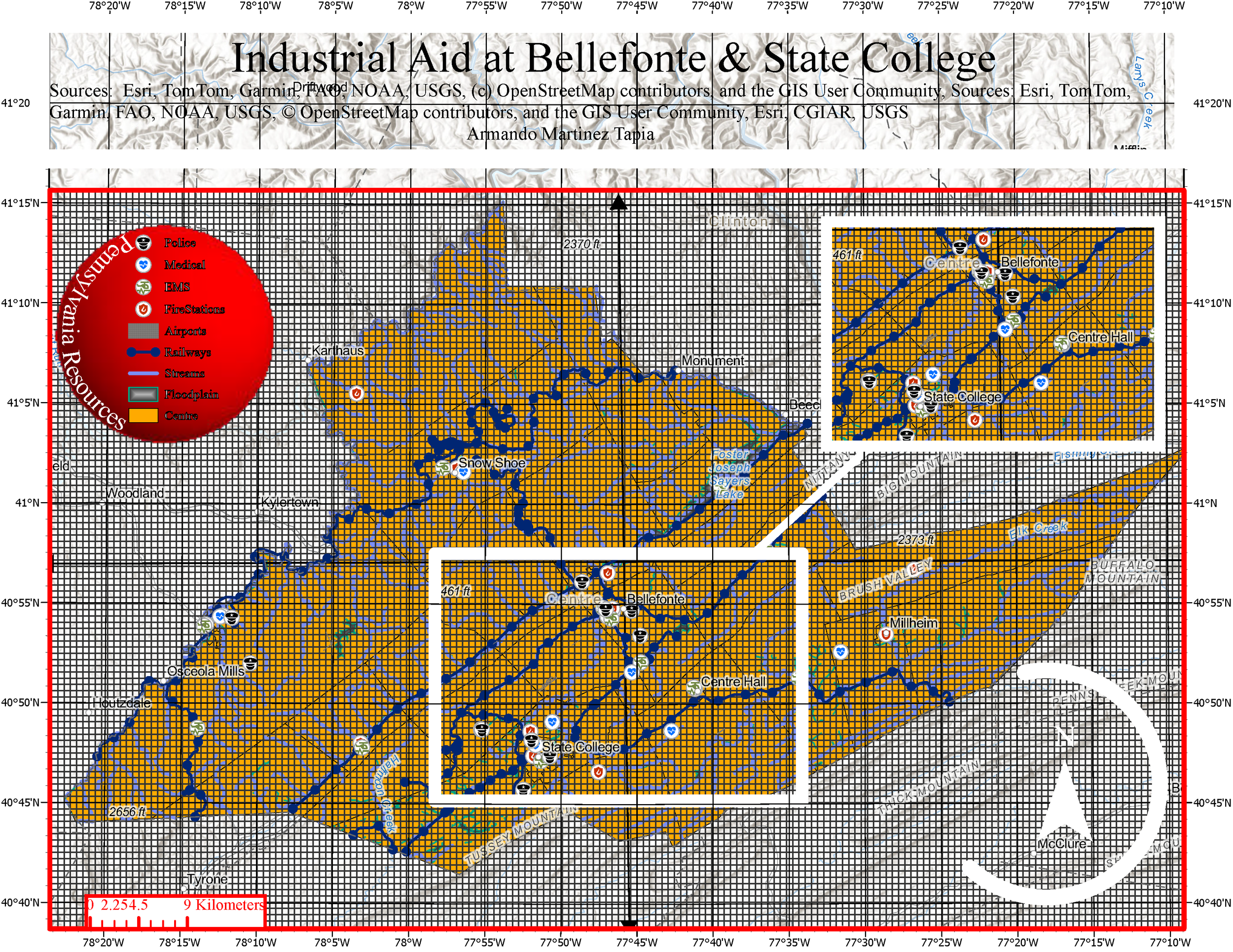
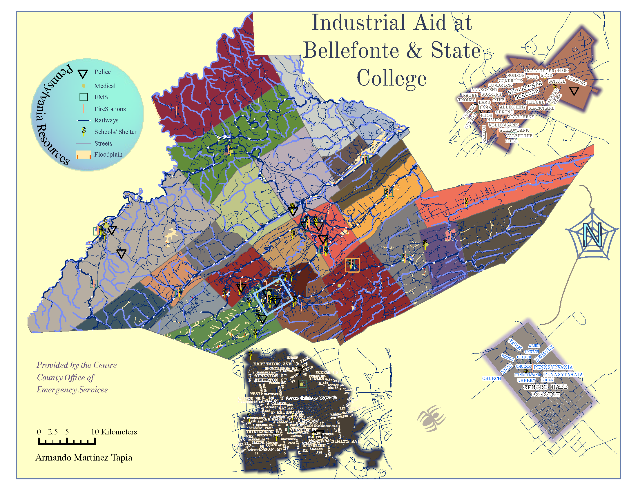
Figure A2.1 demonstrates inspiration exported from René Descartes’ Cartesian coordinate plane; it generates the basic concept for intersections between various points—clusters of resources, at different locations. Figure A2.2, however, is the output of three major boroughs in Pennsylvania: State College Borough, Centre Hall Borough, and Bellefonte Borough’s street address that intersect with Police, Medical, Fire Station, and School emergency centers. Figure A2.2 is a map, alluding to experiments where spiders—tarantulas, that use polarized light to navigate by using homing to survive—symbolizes an animal described leaving its nest to find prey or mate and returning, relying on multimodal cues(Ortega-Escobar, 2020).
A2.2
A4.1
A4.2
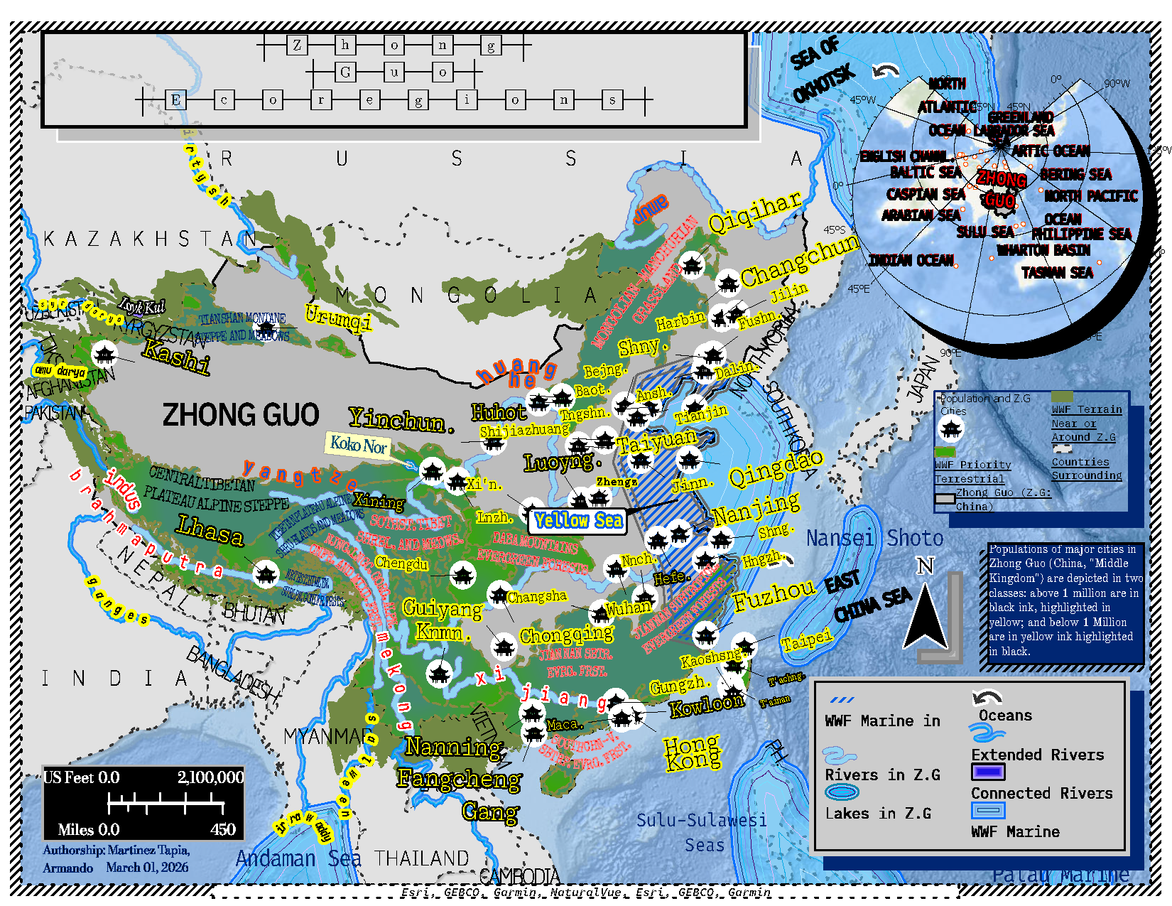
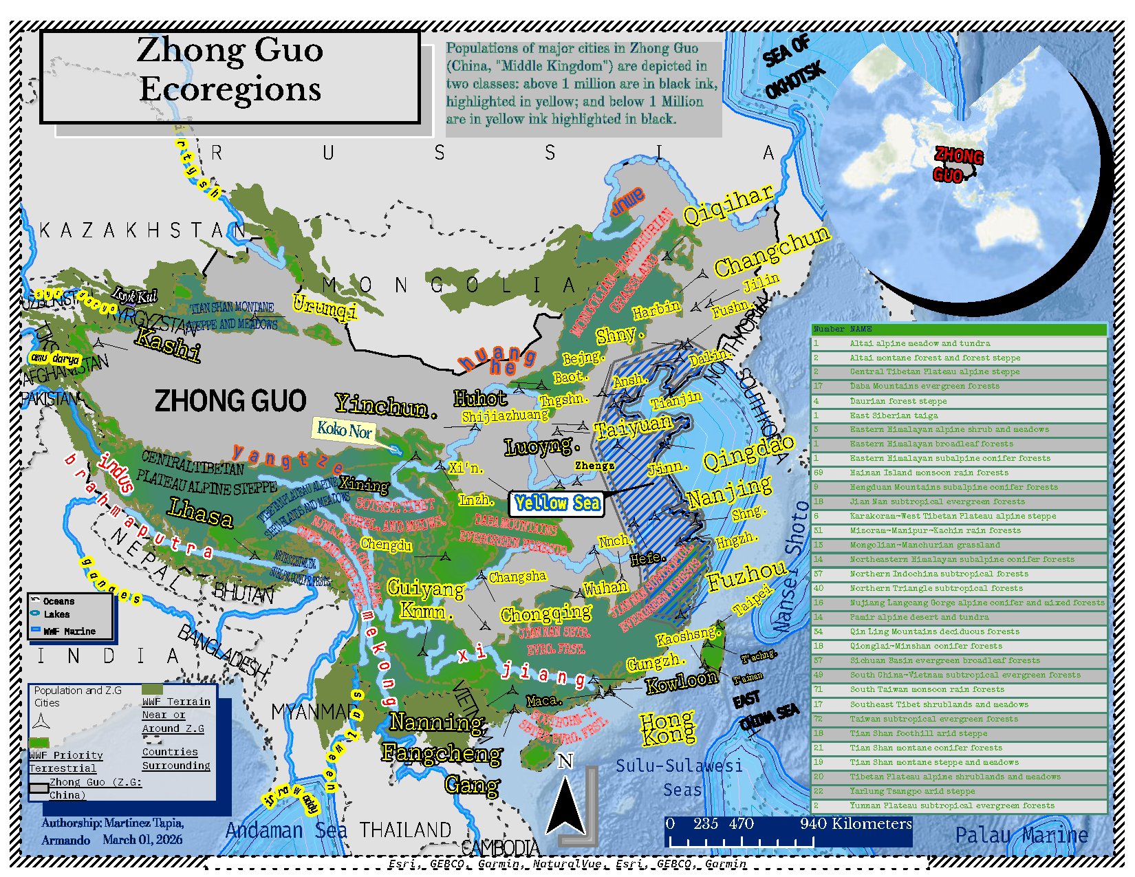
Figure A4.1 is inspired by Système international d’unités (SI)—meters (length), Kilograms (mass), and seconds (time), v. the U.S Customary Measurement System (Serway & Jewett, 2025): feet (length), slug (mass), seconds (time). Printing the labels to meet cartographic standards. The title in figure A4.1 illustrates a font used in programing language to further develop technology and solve world problems. The labels on the map are printed in fonts used for the following programing platforms: R Studio, ArcPy, Python, Google Earth Engine and IBM. The fonts are clear and legible, making them ideal to label a list of countries, cities, rivers, and ecoregions. The military printing style of the fonts summarize computer evolution; it was an analog computer and to date, a modern-day computer with AI services. Figure A4.2 includes a list of the ecoregions while the megacities are visible represented by triangles with call-out lines—together, resemble arrows. All while maintain the same fonts—a political statement in the race to engineer AI agents and reduce Hallucinations.
A6.1
A6.2
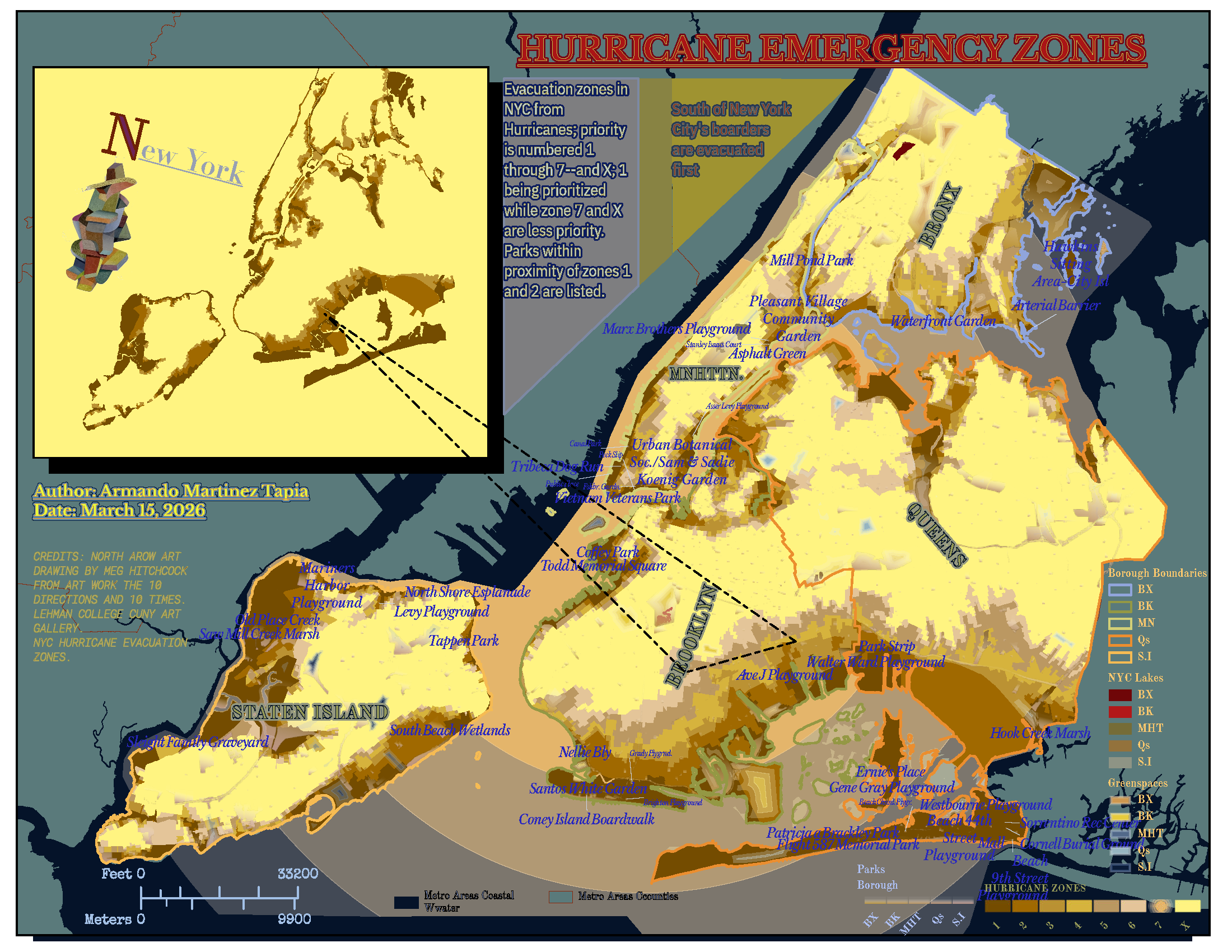
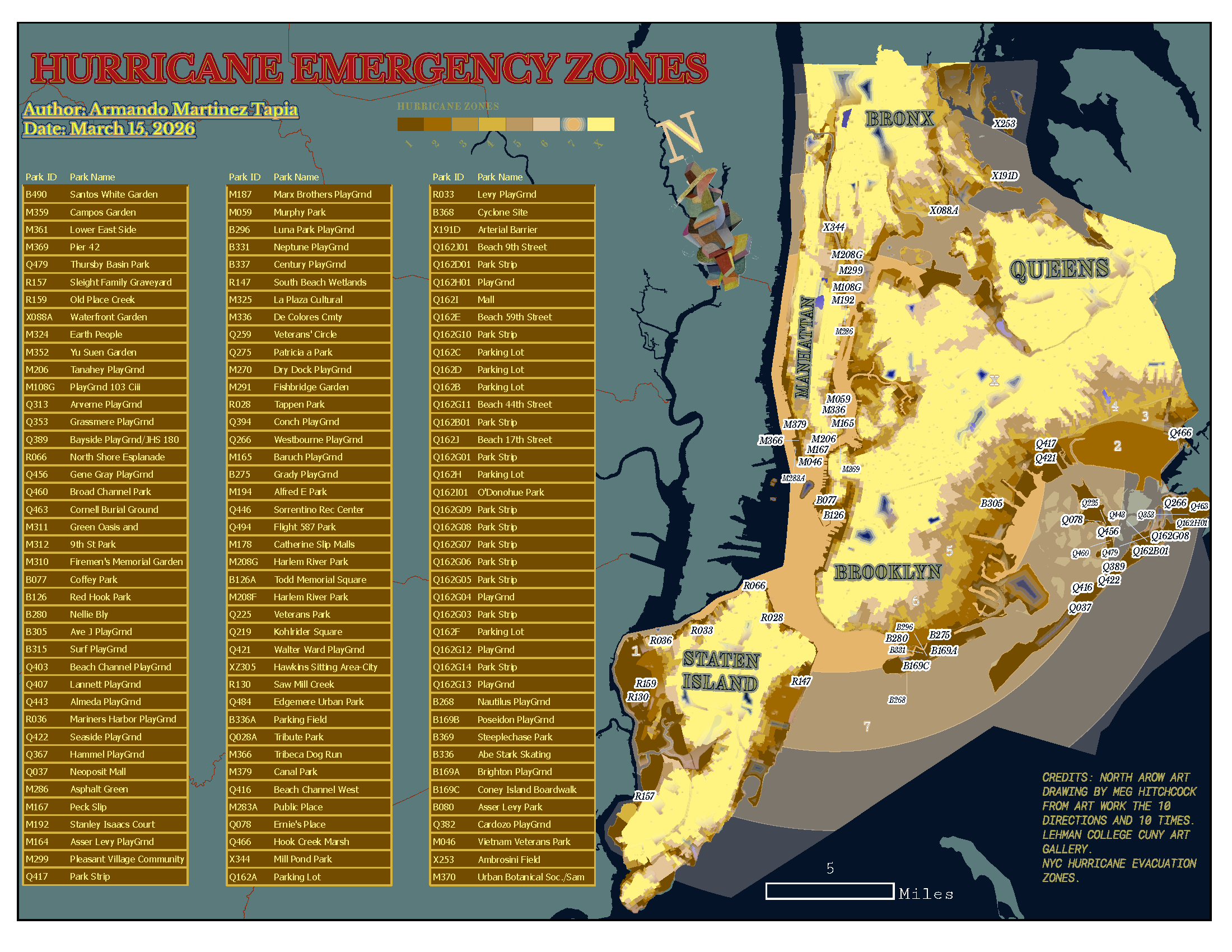
On Figure A6.1 the triangle includes visual hierarchies: color pallets with geometric shapes. The color pallets are extracted from photos of paintings at Lehman College’s art gallery, CUNY (Bronx, NY). The theme of the colors are influenced by street graffiti, ancient text (the Bible, Koran, Rig Veda, and Kabbalah). Efforts continue to present physics by using feet rather than miles or kilometers; it maps where the discipline is occurring(Serway & Jewett, 2025; Longley et al., 2015). By combining both disciplines, figure A6.2 is a map of the respective locations for zone one hurricanes, the parks listed are within the point of intersection of two layers: New York’s coast and where sever hurricanes are prominent.
A7.1
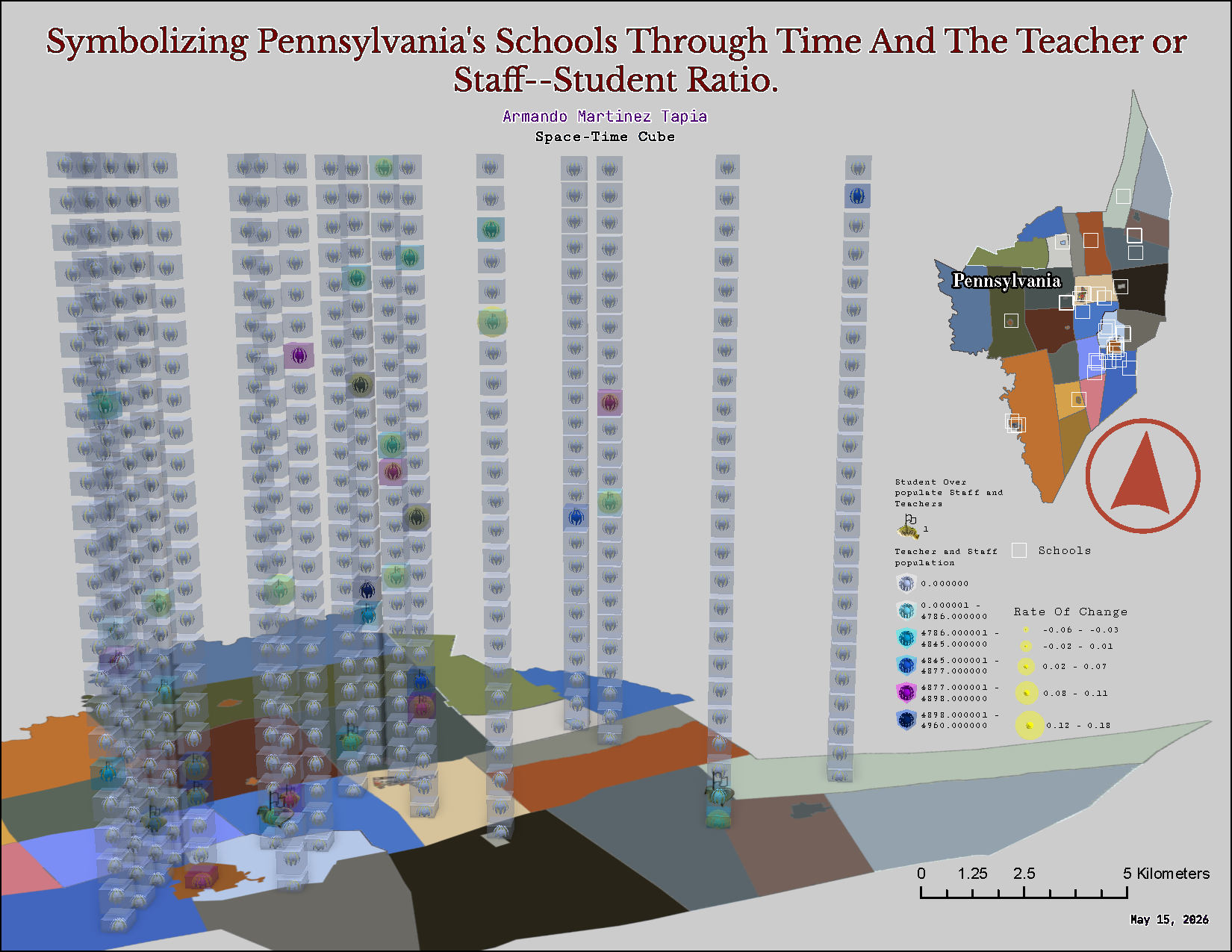
Figure A7.1 is a 3D illusion of population density changing spatially and temporally. A time dependent system: f(x,y,t); initially, f(x,y,t0): from start (0) to the nth term in respect to time (t). Figure A7.1 is an example of a number of teachers and staff proportional to students enrolled—changing spatially and temporally. Figure A7.1 includes exaggerated data and made-up numbers. However, the coordinates are assigned to non-spatial data: school locations in Pennsylvania. Figure A7.1 illustrates where and when! Each cube represents a layer over time (Larson & Edwards, 2023).
A8.1
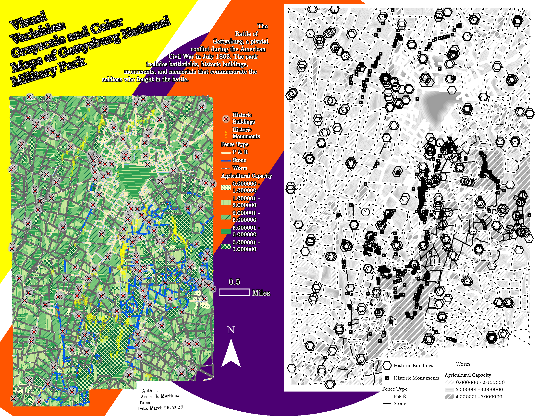
A8.2
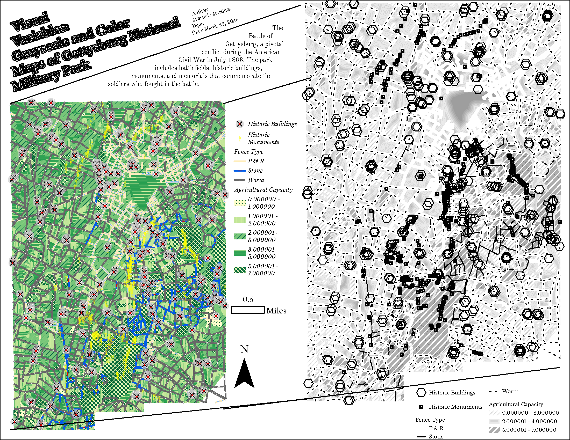
Figure A8.1 is a grid. The lines are the idea of emphasizing the black and white skeletal illustration of Gettysburg National Military Park. The fonts are placed at a 45 degree angle to the black and white map; and the legend is parallel to both maps. Figure A8.2 includes geometrical shapes. The shapes are primary colors; The map with patterns: lines, and hatchets in green, yellow—with blue (fence types), is smaller than the black and white map making the white map appear closer or farther. The black and white map’s symbology is ideal for communicating clusters and congestion.
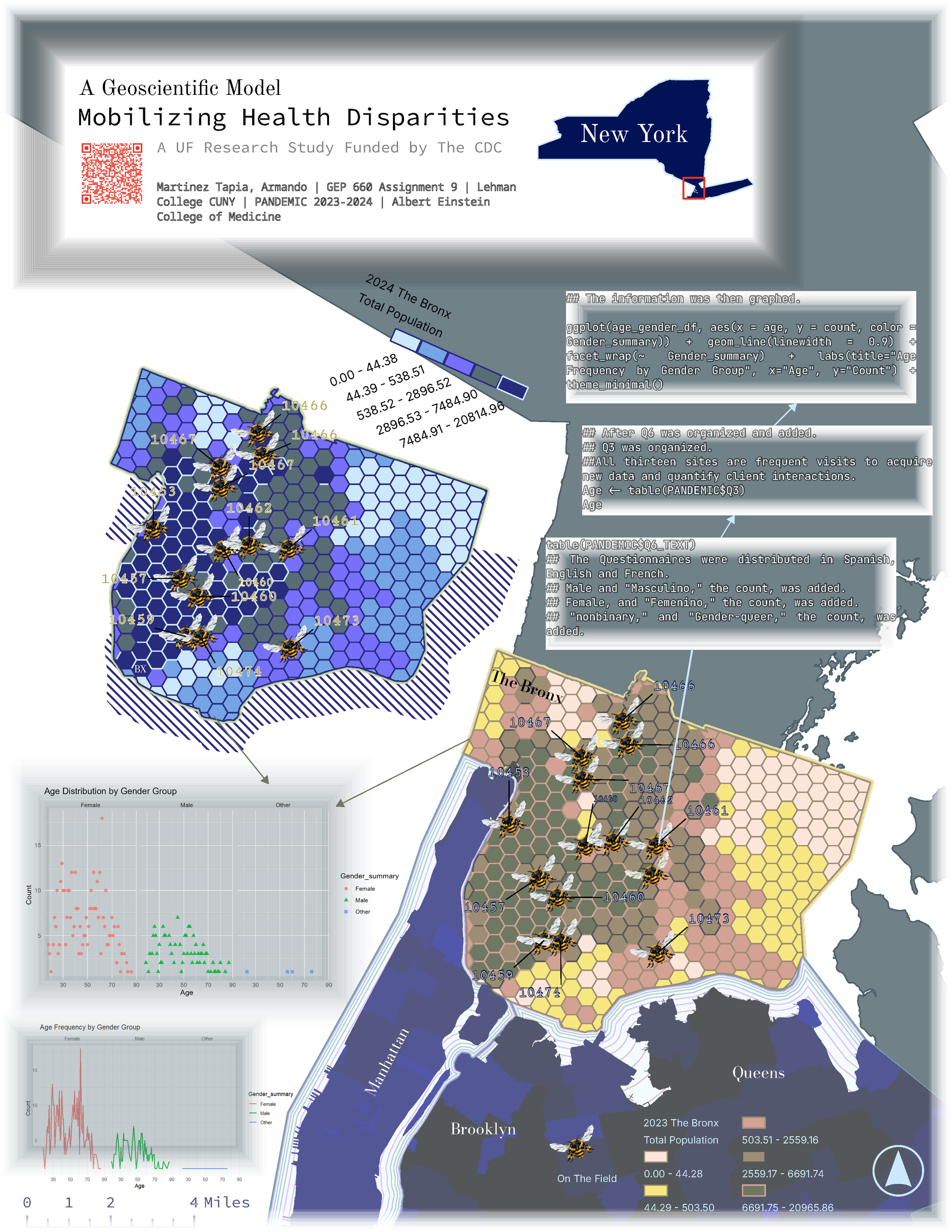
A9
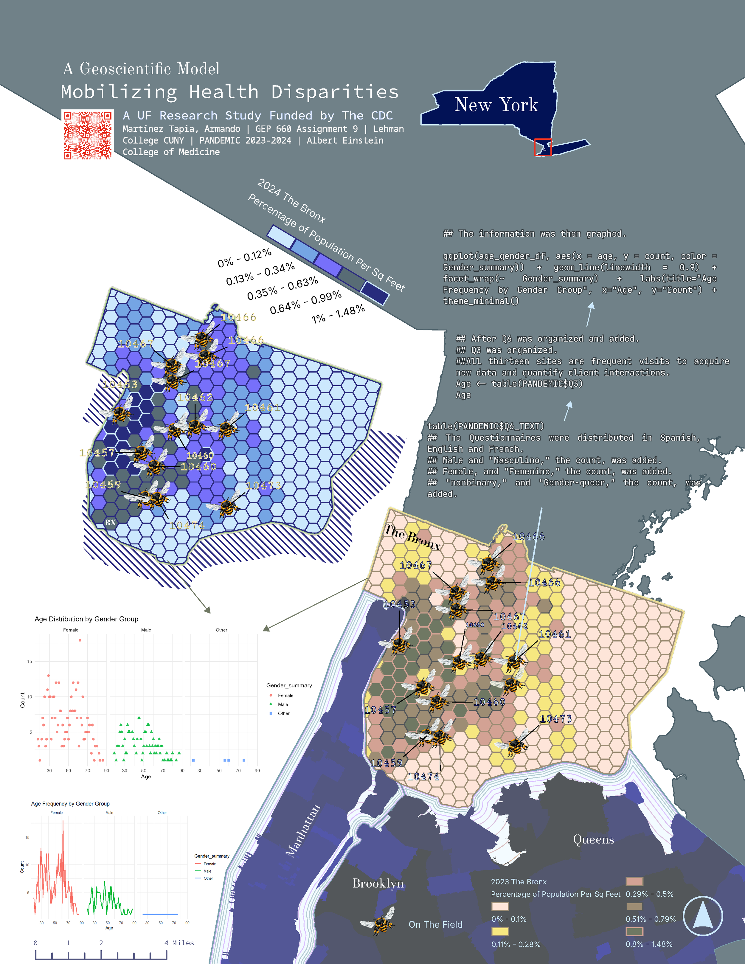
A10
Figure A9 is a map visualizing the State of New York. The data is qualitative data combined with published data from the US Census. Research on vaccinations inspired the white boxes and frames with grey and blue tones. Figure A9 is a map of an idea from 2023. The graphs are exported from R studio; it generates applied statistics on behavioral science. The CDC funded project was a research study on Bronx Residence. For me, the data presented an opportunity to apply what was introduced to me during an undergraduate program at The City College of New York CUNY(New York, NY). Although, political science was an initial major, to me—psychology was the root of my athleticism—health, and became my major; it is the start of my journey. Figure A9 and A10 began in isolation—at Albert Einstein College of Medicine where a young Machiavellian clinical interviewer graphed a map with R studio’s ggplot, a package one should explore. At zip code 1061, all the functions that list, and process ordinal scale data was surprising! Figure A10 is normalized and the data presents an updated interpretation of University of Florida’s Health Assessment qualitative research study. The QR code on the maps provide general information about the project.
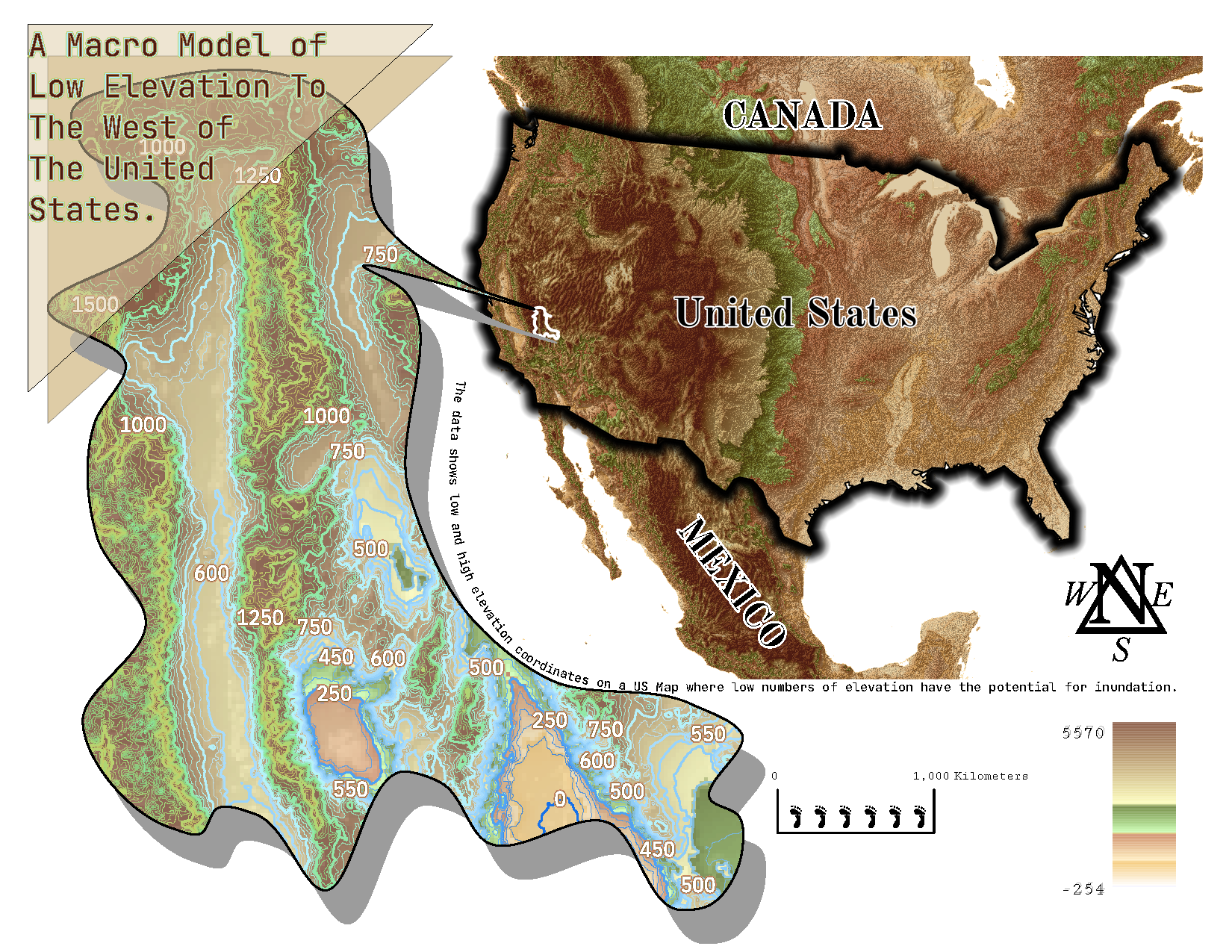
A11
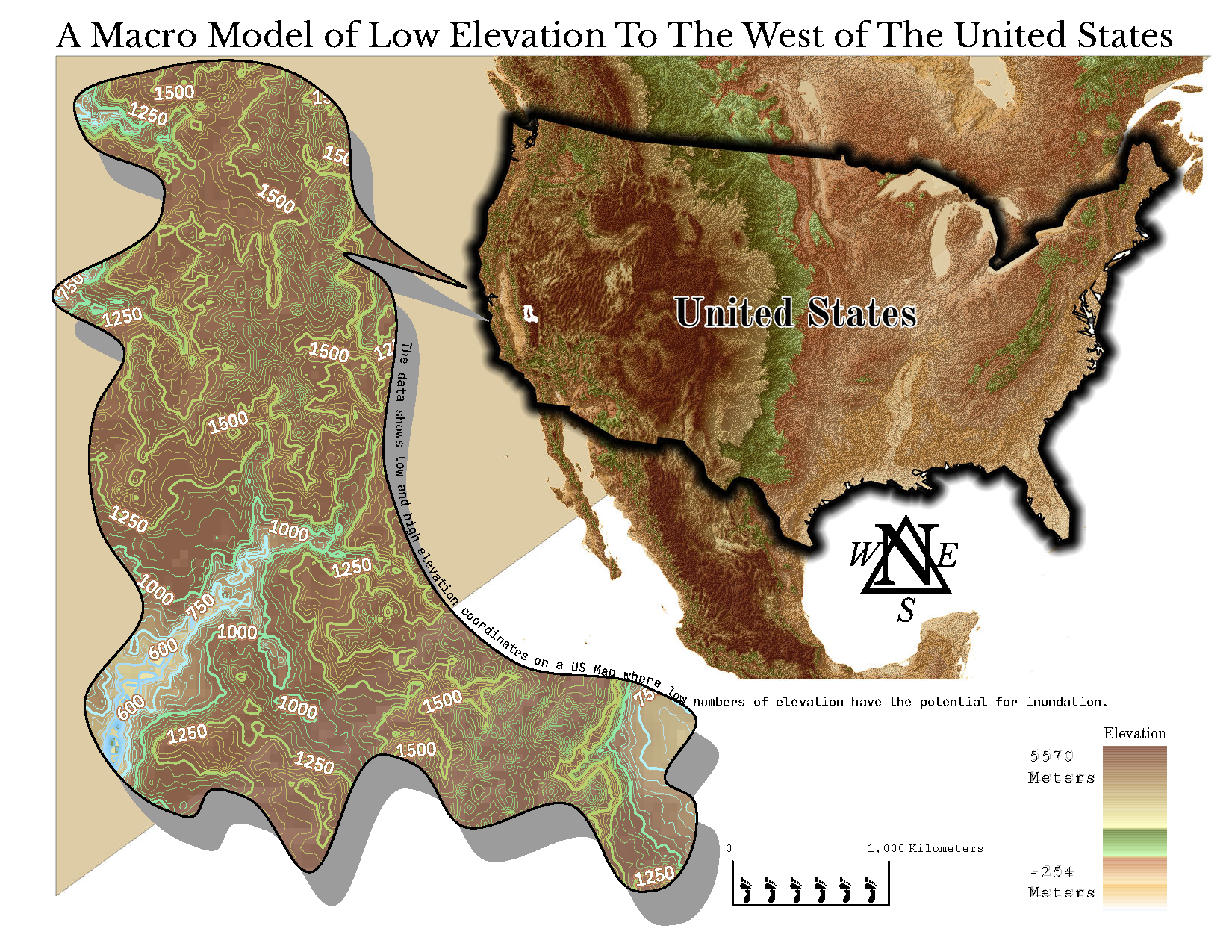
A12
Figure A11 depicts the scale bar with symbols suggesting the U.S Customary Measurement System. However, the S.I unit is placed; and the contour labels are legible: in the context of functions of several variables—a scalar field can be characterized by level curves (contour lines). In Figure A11 and A12, the contour lines are used to map regions on the United States by representing points of constant elevation—height above see level or below. Figure A11 and A12 depict the variation of elevation (z) with respect to spatial coordinates (x and y) based on the spacing between the contour lines. The rapid change in z represent a steep slope (Larson & Edwards, 2023).